Calibration#
The visibility data obtained by correlation contains systematic errors. Many of them shows up as delays, which translate to phase errors in visibility. Source of delays include:
Water vapor in troposphere
Electron content in Ionosphere
Instruments
Clock inaccuracy
..
Thermal noise
Fringe-fitting is a major calibration step to remove the delay and delay rates in the visibility data so they can be coherencely averaged to higher signal-to-noise data.
To get a sense on how this works, let’s set up our numerical experiment. We again need to import the standard python packages. We also turn fix the noise realizations and put our correlator in a function.
import numpy as np
from math import pi, ceil
from matplotlib import pyplot as plt

t  = np.linspace(0, 10_000, num=100_000)
n1 = np.random.normal(scale=1, size=100_000)
n2 = np.random.normal(scale=1, size=100_000)

def chunked_FX(s1, s2, n=1000):
    N  = int(ceil(len(s1) / n))
    S1 = np.fft.rfft(np.pad(s1+n1, (0, N*n-len(s1))).reshape(N, n))
    S2 = np.fft.rfft(np.pad(s2+n2, (0, N*n-len(s2))).reshape(N, n))
    return np.conj(S1) * S2
Adding Delay and Delay Rate#
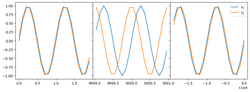
To visualize how the delay and delay rate affect the visibility, we define \(d(t)\) and \(r(t)\) and apply them to the signal for the second station.
d  = lambda t: 1e+3 * t/len(t) + 1
r  = lambda t: 1e-3 * t/len(t) + 1

s1 = np.sin(2 * pi * t)
s2 = np.sin(2 * pi * r(t) * (t + 0.123 / (2 * pi) * d(t)))

fig, (ax0, ax1, ax2) = plt.subplots(1,3, sharey=True, figsize=(12,4))
plt.subplots_adjust(wspace=0)
ax0.plot(t[:20], s1[:20])
ax0.plot(t[:20], s2[:20])
ax1.plot(t[50_000-10:50_000+10], s1[50_000-10:50_000+10])
ax1.plot(t[50_000-10:50_000+10], s2[50_000-10:50_000+10])
ax2.plot(t[-20:], s1[-20:], label=r'$s_1$')
ax2.plot(t[-20:], s2[-20:], label=r'$s_1$')
ax2.legend()
<matplotlib.legend.Legend at 0x7fb3645da9d0>
Correlating the Signals#
Using chunked_FX(), we can compute the visibility.
It has a “spectral” line at freqnecy == 100 because the signal is
still monochromatic.
FX = chunked_FX(s1, s2)

plt.imshow(abs(FX), origin='lower')
plt.xlabel('frequency')
plt.ylabel('time')
Text(0, 0.5, 'time')

Focusing in our band at \(\nu = 100\), it is easy to see the phase drift away from a stable value.
vis = FX[:,100]

fig, (ax0, ax1) = plt.subplots(2,1, sharex=True)
plt.subplots_adjust(hspace=0)

ax0.plot(abs(vis))
ax0.set_ylabel('Amplitude')
ax0.set_ylim(0, 300_000)

ax1.plot(np.angle(vis))
ax1.set_ylabel('Phase')
ax1.set_ylim(-pi, pi)
ax1.set_xlabel('time')
Text(0.5, 0, 'time')
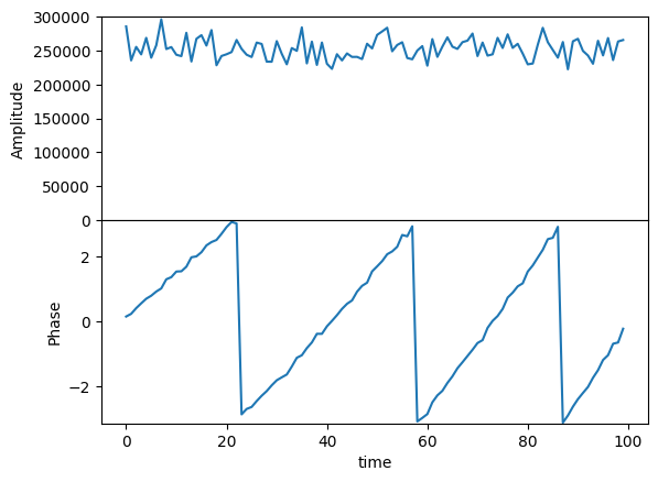
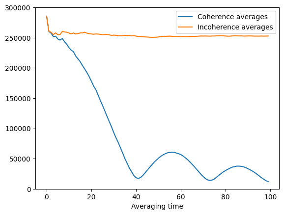
This phase drift affects coherence average. When we average over long time scale, the coherencely averaged amplitude drops, as shown in the following figure. This is the reason incoherence averages are used sometimes.
coh_avgs   = [abs(np.mean(vis[:i])) for i in range(1, 100+1)]
incoh_avgs = [np.mean(abs(vis[:i])) for i in range(1, 100+1)]

plt.plot(coh_avgs,   label='Coherence averages')
plt.plot(incoh_avgs, label='Incoherence averages')
plt.ylim(0, 300_000)
plt.xlabel('Averaging time')
plt.legend()
<matplotlib.legend.Legend at 0x7fb344d70390>
Fringe-Fitting#
The idea behind fringe-fitting is that we can expand the phase of an arriving signal in terms of frequency and phase
where \(\phi_0\) is the phase error, \(\partial\phi/\partial\nu\) is the delay, and \(\partial\phi/\partial t\) is the (delay) rate. Any process that estimate the delay and rate is considered fringe-fitting.
For phase in the visibility, the idea is the same,
HOPS performs fringe fitting for each baseline independently, so effectively it is fitting for the terms \((\partial\phi_1/\partial\nu - \partial\phi_2/\partial\nu)\) and \((\partial\phi_1/\partial t - \partial\phi_2/\partial t )\).
In principle, we may use \(\chi^2\)-fitting to fit a straight line to the phase, and de-rotate the visibility using such a fit. In practice, however, because phase is a circular (or directional) quantity, it is non-trivial to write a \(\chi^2\)-fitting method that can work for arbitrary number of phase wraps.
Fortunately, Fourier transform has an interesting property that is useful for fringe fitting. Consider a function \(f(t)\) and its Fourier transform \(\hat{F}_\nu\). When shifted by \(t_0\) in time, the phase of the Fourier coefficient is subjected to a linear rotation. This can be easily proved. Let \(g(t) = f(t - t_0)\) and \(\hat{G}_\nu\) be its Fourier transform,
Therefore, it is possible to identify the linear part of phase drift by solving for a shift in the Fourier transform of the visibility.
Here, we will remove the rate in our synthetic data.
We first perform Fourier transform of our visibility.
The fftshift() is not essential—it simply help plotting.
Vis = np.fft.fftshift(np.fft.fft(vis))
R   = np.fft.fftshift(np.fft.fftfreq(100))
Rp  = R[np.argmax(abs(Vis))] # location of the peak in `Vis`

print(Rp)

plt.plot(R, abs(Vis))
plt.xlabel('spectral domain')
plt.ylabel('amplitude')
plt.axvline(Rp, color='r', linestyle=':')
0.03
<matplotlib.lines.Line2D at 0x7fb3642f9950>
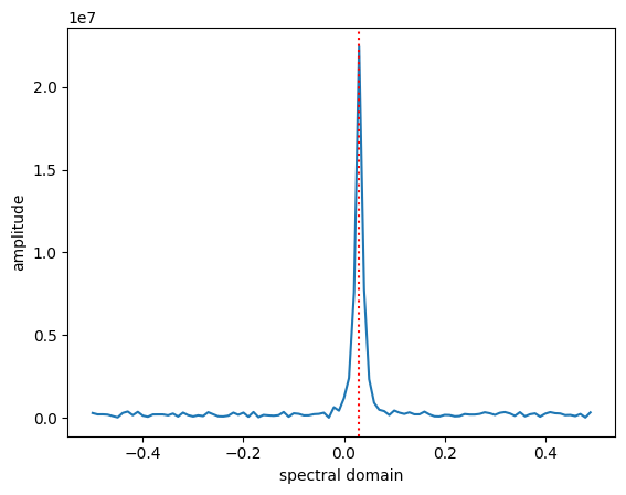
With Rp, we can derotate the phase in the visiblity:
viscal = vis * np.exp(-2j * pi * Rp * np.arange(len(vis)))

plt.plot(np.angle(vis),    label='correlated')
plt.plot(np.angle(viscal), label='calibrated')
plt.xlabel('time')
plt.ylabel('phase')
plt.legend()
<matplotlib.legend.Legend at 0x7fb344d20990>
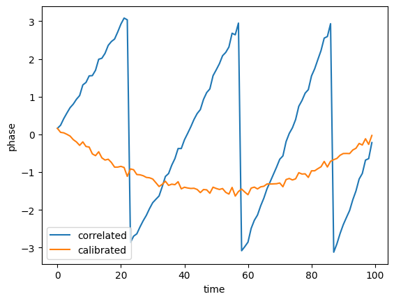
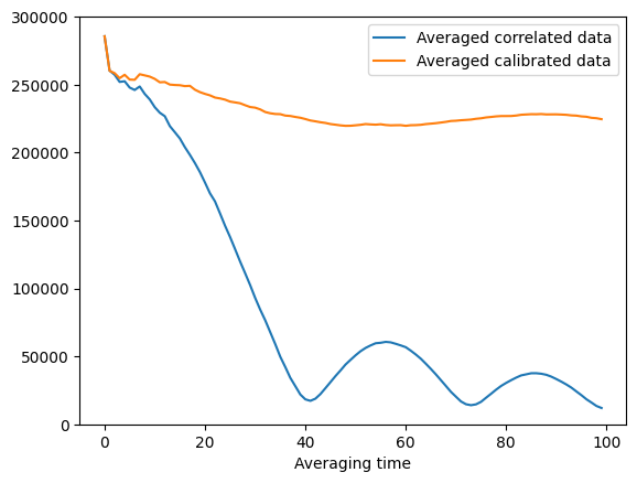
Without the linear trend, we can perform coherence average for much longer time.
vis_avgs    = [abs(np.mean(vis[:i]))    for i in range(1, 100+1)]
viscal_avgs = [abs(np.mean(viscal[:i])) for i in range(1, 100+1)]

plt.plot(vis_avgs,    label='Averaged correlated data')
plt.plot(viscal_avgs, label='Averaged calibrated data')
plt.ylim(0, 300_000)
plt.xlabel('Averaging time')
plt.legend()
<matplotlib.legend.Legend at 0x7fb344c29350>
